Mobile Search UX for Shopify: 10 Patterns That Actually Convert
Your mobile shoppers aren't browsing. They're hunting. Here are the search UX patterns that turn thumb-scrollers into buyers.
She typed "blue dress summer" into the search bar on her phone.
The store had 47 blue dresses. The search returned zero.
I know this because she was my wife, and she was shopping on a Shopify store I was auditing for a client. She showed me her screen, laughed, and said, "This is why I just go to Amazon."
That sentence cost someone a sale. And if your mobile search UX looks anything like what she experienced, it's costing you dozens of sales every single day.
Here's the thing most Shopify merchants miss: over 70% of your traffic is mobile. But most store owners design their search experience on a desktop monitor, test it with a mouse, and wonder why mobile conversions stay flat.
Mobile search isn't desktop search on a smaller screen. It's a completely different behavior. Different intent. Different patience threshold. Different finger anatomy.
Stay with me here. I'm going to walk you through 10 mobile search UX patterns that actually work in Shopify stores. Not theoretical stuff from UX textbooks. Patterns we've seen move the needle in real stores, with real customers, spending real money.
Pattern 1: The Full-Screen Search Takeover

This is wrong for mobile.
The pattern that works? When someone taps search, take over the entire screen. Full viewport. Big input field. Generous tap targets. Recent searches. Trending queries. Popular categories.
Why? Because on mobile, search is a commitment. The shopper has decided they want something specific. Reward that intent with a dedicated experience, not a cramped afterthought tucked into a 44px header bar.
The best implementations we've seen also show trending searches and popular products in this takeover view, even before the customer types a single letter. It reduces cognitive load and gives people a shortcut.
The rule: If search is important enough to exist, it's important enough to own the screen when activated.
Pattern 2: Sticky Search Bar on Scroll

A customer scrolls through your collection page. They see 30 products. None are what they want. Now they need to scroll all the way back to the top to use search.
They won't. They'll leave.
A sticky search bar stays visible no matter how far down the page the customer scrolls. It's always there. Always accessible. Always saying, "Can't find it? Tell me what you want."
This is especially critical on collection pages with 50+ products. The further someone scrolls without finding what they want, the more frustrated they get. A sticky search bar catches them at the exact moment frustration peaks.
You don't need custom code for this. Most modern Shopify themes support sticky headers, and tools like Sparq let you add a persistent search bar that follows the shopper down the page.
Pattern 3: Instant Visual Autocomplete

When someone types "sneak" on a shoe store, showing a list of text suggestions like "sneakers," "sneaker cleaner," "sneaker shelf" is fine. But you know what's better?
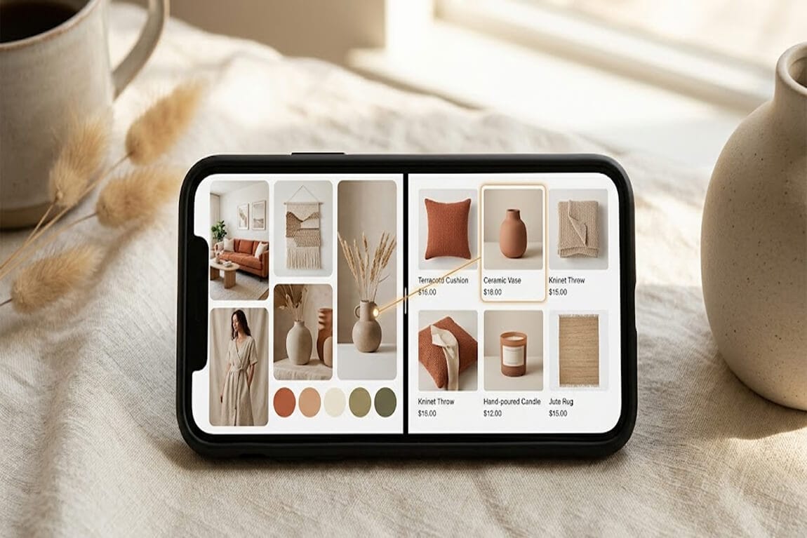
Showing the actual product images next to each suggestion.
Mobile shoppers are visual. They're scanning. A tiny product thumbnail next to each autocomplete suggestion does two things: it confirms they're on the right track, and it lets them tap directly into a product without ever visiting a results page.
This is the part that costs you money: every extra tap between search and product page is a drop-off point. Visual autocomplete removes one of those taps.
We've seen stores using instant search with product images increase search-to-purchase conversion by 15-20%. That's not a rounding error. That's rent money.
Pattern 4: Horizontal Filter Chips

On desktop, a left sidebar with expandable filter groups is perfectly fine. On mobile, that sidebar either disappears entirely (bad) or gets shoved into a hamburger menu (worse) or takes over half the screen (terrible).
The pattern that works: horizontal scrollable filter chips at the top of the search results page.
Think of them like hashtags. Small, tappable pills that say "Color," "Size," "Under $50," "In Stock." The customer swipes horizontally to see more options. Taps one. The results update instantly.
Why this works on mobile:
It doesn't eat vertical space. Your products stay visible. The filters ride along the top, taking up maybe 44 pixels of height.
It's thumb-friendly. Horizontal swiping is the most natural gesture on mobile. You're working with the phone, not against it.
It shows active filters clearly. A highlighted chip is instantly recognizable. The customer always knows what's filtered and can un-tap to remove it.
If you want to see this in action, look at how the best ecommerce filter designs handle mobile layouts. The good ones all converge on some version of this chip pattern.
Pattern 5: Voice Search Input

Mobile shoppers are often multitasking. Cooking dinner. Riding the train. Waiting in line. Typing "waterproof hiking boots size 11 wide" on a phone keyboard is painful.
But saying it? Easy.
Adding a voice search input to your mobile search bar lowers the effort threshold dramatically. The customer taps the mic icon, says what they want, and the query populates automatically.
But then something clicked for us. It's not just about convenience. Voice queries are longer and more specific than typed queries. People type "boots." People say "brown leather ankle boots under a hundred dollars." That extra specificity means better results, which means higher conversion.
This only works if your search engine can actually handle natural language queries. Shopify's default search will choke on anything longer than two words. You need something with natural language understanding built in.
If you're tired of customers searching and leaving empty-handed, Sparq fixes that in about 10 minutes. Free to try.
Pattern 6: "No Results" Recovery Flow

Most Shopify stores show a sad little message: "No results found for 'cashmere sweater'." And then... nothing. A dead end. A blank screen on a phone. The shopper's thumb hovers over the back button, and two seconds later they're gone.
The recovery flow that works has three layers:
Layer 1: Spell correction. Did they mean "cashmere" when they typed "cashmer"? Fix it automatically or offer a "Did you mean..." link.
Layer 2: Alternative suggestions. Show related products, popular items in a similar category, or trending products. Anything to keep them shopping.
Layer 3: Category browsing. If search truly fails, give them a clear path into your collections. Big, tappable category buttons right there on the no-results page.
We've written a whole piece on no results page design ideas if you want to go deeper. But the core principle is simple: a dead end on mobile is a lost customer. Always offer a next step.
Pattern 7: Recent and Saved Searches

Someone finds a product they like at lunch. They don't buy it. They come back at 9 PM on the couch. They open your store and think, "What was that thing I searched for earlier?"
If your search bar remembers their recent queries, you've just eliminated 15 seconds of friction and a moment of doubt. That's not trivial. On mobile, every second of hesitation is a potential exit.
Recent searches should appear automatically when someone taps the search bar. No typing required. Just tap and pick up where you left off.
Some stores go further with saved searches, letting customers bookmark specific queries to revisit later. This is especially powerful for stores with rotating inventory, where customers are watching for restocks.
This is the kind of detail that separates stores doing $10K/month from stores doing $100K/month. It's not about having more products. It's about removing the friction between wanting and buying. Stores that measure search effectiveness know exactly how much revenue these small details recover.
Pattern 8: Search Results with Quick-Add Buttons

The pattern: show a quick-add button directly on each product card in the search results. The customer searches, sees what they want, taps the plus icon, and the item goes into the cart. No product page visit required.
This matters most for stores selling consumables, basics, or replenishment products. Nobody needs to read the full product description of a phone case they've bought three times. They just need to find it and add it.
For stores with variants (size, color), the quick-add can trigger a small modal that lets them select options without leaving the results page.
The rule: Don't make mobile shoppers navigate to a page they don't need to see.
This is a conversion optimization pattern that pairs perfectly with optimized ecommerce filters. Search gets them to the product. Quick-add gets the product to the cart. Together, they compress the entire purchase funnel.
Pattern 9: Contextual Sort Controls

Most Shopify themes bury sort options in a dropdown that's hard to find, hard to tap, and doesn't reflect what mobile shoppers actually care about.
Here's what we've found works: a bottom-sheet sort control that slides up from the bottom of the screen. Large tap targets. Clear labels. And context-aware defaults.
What does "context-aware" mean? If someone searched for "gift under $30," default the sort to price ascending. If they searched for "new arrivals," sort by newest. If it's a generic query, default to relevance.
Smart default sorting based on query intent reduces the number of interactions needed to find the right product. Every removed interaction is a conversion barrier eliminated.
This becomes especially important during high-traffic seasons when your search results page design can make or break your daily revenue numbers.
Pattern 10: Persistent Search Context Across Pages

When a mobile shopper searches for something, taps into a product, decides it's not quite right, and hits the back button, what should happen?
They should land exactly where they left off. Same results. Same scroll position. Same filters applied.
What actually happens on most Shopify stores? The page reloads. The search is gone. They're dumped back on the homepage. And they have to start over.
This breaks the shopping flow in a way that's almost invisible to the store owner but painfully obvious to the customer.
Persistent search context means the search state is preserved across page navigations. The customer can browse in and out of individual products without losing their place in the results.
This requires client-side state management that Shopify's default search doesn't support. It's one of those technical details that advanced search algorithms handle behind the scenes but shoppers feel immediately.
The Pattern Behind the Patterns

Mobile screens are small. Thumbs are fat. Patience is thin. Connectivity can be spotty. Sessions are interrupted.
Every pattern above is designed to work within those constraints instead of fighting them. Full-screen takeovers because screen space is precious. Filter chips because sidebars don't fit. Quick-add because page loads are expensive. Persistent context because the back button shouldn't be a reset button.
You don't need to implement all 10 at once. Pick the three that address your biggest pain points. If your search analytics show high "no results" rates, start with Pattern 6. If customers are bouncing from collection pages, try Patterns 2 and 4. If autocomplete conversion is low, Pattern 3 is your move.
Want to see what your customers are actually searching for? Install Sparq and check your search analytics. It's eye-opening.
And whatever you do, test it on a phone. Your phone. Your mom's phone. A phone with a cracked screen protector and a thick case. Because that's what your customers are using.
The stores that win on mobile aren't the ones with the fanciest themes or the biggest ad budgets. They're the ones that made it dead simple to find and buy a product with one thumb, standing in line at a coffee shop, with three seconds of attention to spare.
That's what good mobile search UX looks like. Not pretty. Not clever. Just fast, forgiving, and out of the way.
Frequently Asked Questions
What is mobile search UX in ecommerce?
Mobile search UX refers to how the search experience is designed and optimized specifically for smartphone users on ecommerce stores. It covers everything from search bar placement and autocomplete behavior to filter layouts and results page design, all tailored for touch interaction, small screens, and on-the-go shopping behavior.
How does mobile search UX affect Shopify conversion rates?
Stores with optimized mobile search typically see 20-30% higher conversion rates from search users compared to non-search users. Since search users already have purchase intent, improving the mobile search experience directly reduces abandonment and increases add-to-cart rates. Patterns like visual autocomplete and quick-add buttons compress the path from search to purchase.
What is the best Shopify search app for mobile UX?
Sparq is built specifically for Shopify with mobile-first search UX including AI-powered natural language understanding, instant visual autocomplete, smart filters, and search analytics. Unlike enterprise tools like Algolia, it's designed for growing Shopify stores with a 10-minute setup and no developer needed. Other options include Searchanise and Boost Commerce, though they offer less AI capability and limited mobile-specific features.
Does adding a search app slow down my Shopify store on mobile?
A well-built search app should not noticeably impact page load speed. Sparq uses asynchronous loading and lightweight scripts specifically optimized for mobile performance. The key is choosing an app that loads search functionality on demand rather than embedding heavy scripts on every page load. You can check your store's performance impact in Google PageSpeed Insights before and after installation.
How do I know if my current mobile search UX needs improvement?
Check three metrics in your analytics: mobile search exit rate (how often people leave after searching), zero-result rate (how often searches return nothing), and search-to-purchase conversion rate. If your mobile search exit rate is above 30%, your zero-result rate is above 10%, or search converts lower on mobile than desktop, your mobile search UX has significant room for improvement.


