Your filters aren't a feature. They're the difference between a sale and a bounce.
Last Tuesday, I watched a session recording that made me want to throw my laptop.
A shopper landed on one of our client's stores. She searched "blue running shoes women size 8." Got 340 results. Scrolled. Scrolled more. Then she did what 68% of shoppers do when filters fail them.
She left.
Not because the store didn't have her shoe. They had seven of them. She just couldn't find them fast enough.
This is where most Shopify merchants misunderstand ecommerce filter design. You think of filters as a nice-to-have sidebar widget. Something your theme came with. Something you set up once and forgot about.
But here's the thing that costs you money: your filters are your store's navigation system. When they work, shoppers find products in seconds. When they don't, you're basically hiding your own inventory from the people who came to buy it.
I've spent the last two years studying filter patterns across hundreds of ecommerce stores. Not just what they look like, but what actually moves the conversion needle.
Here are 12 ecommerce filter design patterns that work. Not in theory. In real stores, with real revenue impact.
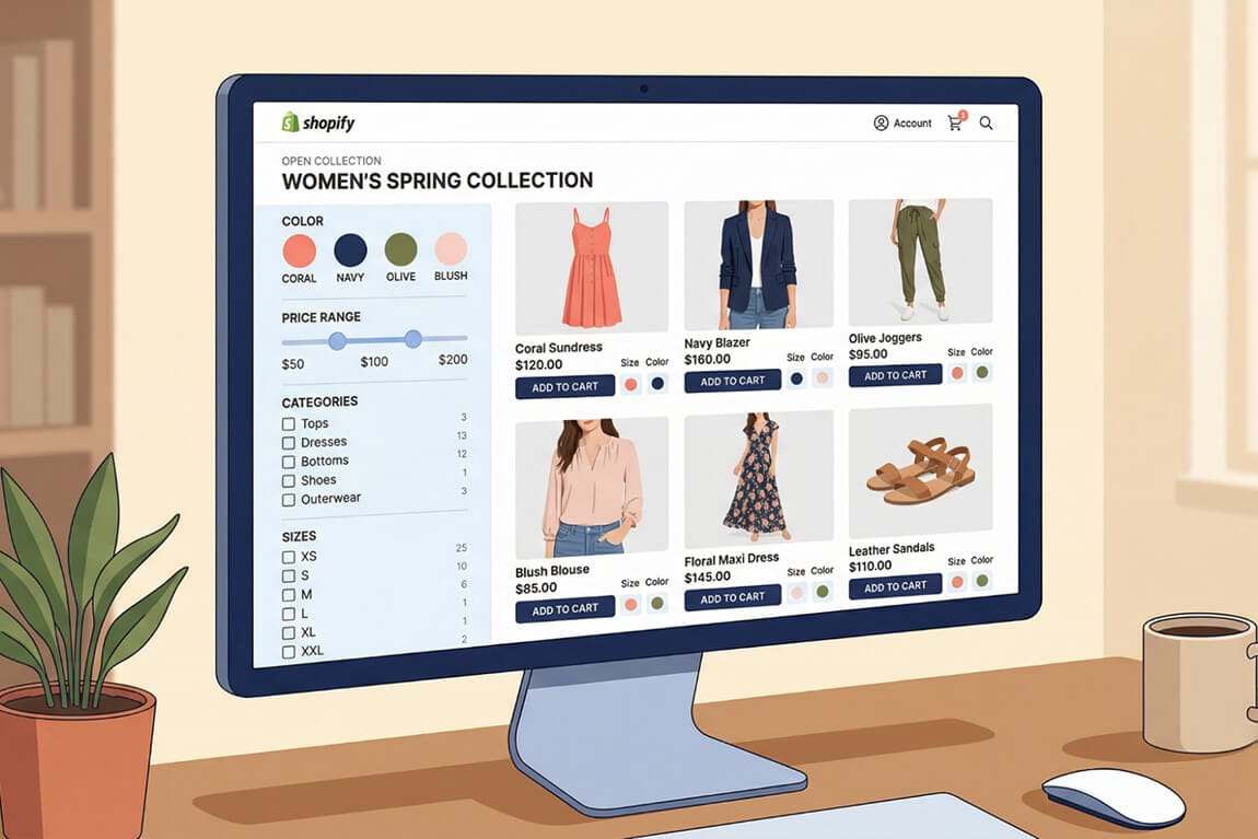
1. The Dynamic Sidebar Filter

This is the workhorse. The vertical sidebar filter sitting on the left side of your collection page, with collapsible groups for each attribute.
It works because shoppers have been trained on it. Amazon uses it. Target uses it. Your customer's brain already knows where to look and how to interact with it.
But here's where most stores get it wrong: they show every possible filter for every collection. You don't need a "screen size" filter on your shoe category page.
The conversion insight: Dynamic filters that adapt to the collection being browsed outperform static filter lists by a measurable margin. When a shopper sees only the filters that matter to what they're looking at, cognitive load drops. Decisions get faster.
The best implementations show the number of matching products next to each filter option. That little "(24)" next to "Size Medium" tells the shopper their choice won't lead to a dead end.
2. Horizontal Filter Bar

Zara popularized this one. Instead of a sidebar, you stack your filters horizontally across the top of the product grid.
It sounds like a small change. It's not.
The horizontal bar forces discipline. You can only fit 4 to 6 filter categories across a screen, which means you have to choose the ones that actually matter. That constraint is a feature, not a bug.
The conversion insight: Horizontal filters work exceptionally well for fashion and apparel stores where the primary differentiators are visual (color, size, style). Shoppers see the filters before they start scrolling the product grid, which means they're more likely to use them.
Stay with me here. This is the part most merchants miss: horizontal filters perform better on wider screens but can create problems on tablets. If you go this route, make sure the bar scrolls horizontally on smaller viewports or collapses into a "Filter" button.
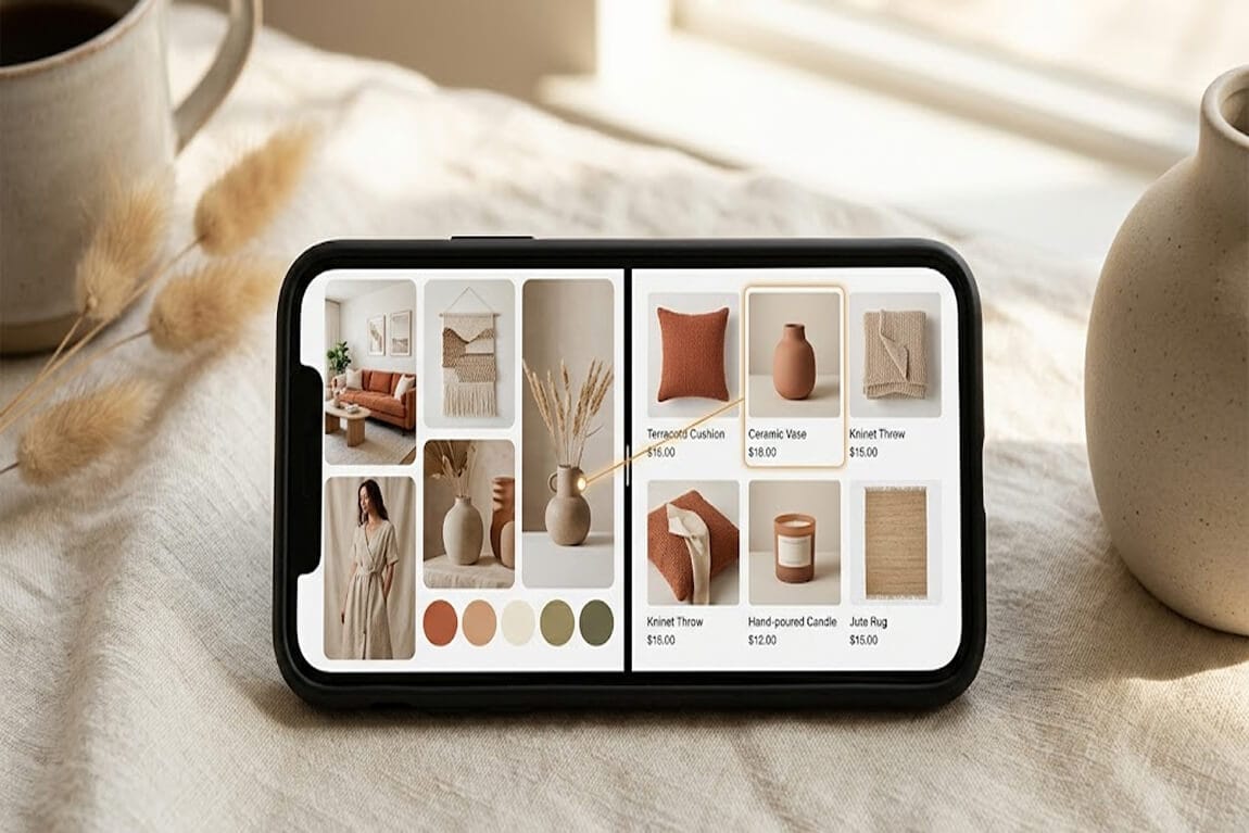
3. Color Swatch Filters

Stop making people read the word "Navy" and guess what shade of blue you mean.
Color swatch filters replace text labels with actual visual circles of the color. It sounds obvious, but Baymard's research found that a significant percentage of major ecommerce sites still use text-only color filters.
The conversion insight: Shoppers process color visually, not linguistically. When someone is looking for a dusty rose top, they don't want to scan through "Pink," "Rose," "Blush," "Salmon," and "Coral" trying to guess which one matches the picture in their head. They want to see the color and tap it.
The best implementations show a subtle checkmark or border change on selected swatches, so shoppers always know which colors are active.
For Shopify stores with large catalogs, this is the single highest-impact filter upgrade you can make. It reduces the time between "I want something in that color" and "found it" to about one second.
4. Price Range Slider

Checkboxes for price ranges ($0 to $25, $25 to $50, $50 to $100) feel easy to implement. But they're quietly costing you sales.
Here's why: a shopper with a $75 budget has to select two checkbox ranges and hope they overlap correctly. A slider lets them drag to exactly $75 and see what's available.
The conversion insight: Price sliders give shoppers a sense of control that checkboxes don't. They can explore. "What if I stretch to $90?" becomes a single drag, not a mental math exercise.
The best price sliders also show the distribution of products across the range. If most of your inventory clusters between $40 and $80, the shopper should be able to see that density visually.
Pro tip: always include manual input fields alongside the slider. Some shoppers want precision. Let them type "$47" if that's their exact number.
5. Multi-Select Checkboxes with Count Badges

This pattern looks basic. Every store has checkboxes. But the count badges are what separate the amateurs from the pros.
When a shopper sees "Cotton (47)" and "Silk (3)", that count badge does two things. It prevents dead-end frustration (they won't select a filter that returns zero results). And it subtly signals what's popular, guiding indecisive shoppers toward categories with more selection.
The conversion insight: Count badges reduce filter abandonment. Nothing kills a shopping session faster than selecting a filter and getting a "No products found" page. The count badge eliminates that anxiety before the click happens.
Pair this with "OR" logic within the same filter group. If someone selects both "Nike" and "Adidas," show products from either brand, not products that are somehow both at once.
You'd be surprised how many stores get this logic wrong. Over 15% of ecommerce sites don't support combining multiple filter values within the same category.
6. Applied Filter Tags (Breadcrumb-Style)

This one is about visibility, not selection.
After shoppers apply filters, they need to see exactly what's active. Applied filter tags sit above the product grid as small dismissible pills: "Size: M ✕" "Color: Black ✕" "Under $50 ✕."
The conversion insight: Shoppers forget what they've filtered. Seriously. They'll apply three filters, scroll through results, and then wonder why they're only seeing 12 products. The tags answer that question instantly without requiring them to scroll back up to the filter panel.
The dismiss button on each tag is critical. One-tap removal of a single filter feels empowering. "Clear All" as a link below the tags is the safety net.
This pattern pairs with almost every other filter style on this list. It's not a replacement for your filter panel. It's a companion that makes the whole filtering experience feel more intuitive.
7. Sticky Mobile Filter Button

More than 70% of ecommerce traffic is mobile. And on mobile, sidebar filters don't exist.
The sticky filter button sits at the bottom of the screen, always visible, always reachable with a thumb. Tap it, and a full-screen filter drawer slides up from the bottom.
The conversion insight: If mobile shoppers have to scroll to the top of the page to access filters, most of them won't bother. The sticky button removes that friction entirely. It says "your filters are right here, whenever you need them."
The best implementations pair "Filter" and "Sort" side by side in the sticky bar. They're different actions, but shoppers often confuse them. Putting them together reduces that confusion.
Inside the filter drawer, use large touch targets. Fat fingers on small checkboxes is a recipe for frustration and higher search abandonment rates.
8. Visual Size Grid

For apparel stores, size filters should feel like the size selector on a product page, not a boring checklist.
A grid of tappable buttons (XS, S, M, L, XL) with visual states for selected, available, and out-of-stock gives shoppers the fastest size narrowing experience possible.
The conversion insight: Graying out unavailable sizes directly in the filter prevents the most frustrating ecommerce experience: falling in love with a product only to discover it doesn't come in your size. The filter tells you upfront, before you've invested emotional energy.
This pattern is essential for any store selling clothing, shoes, or accessories. If your size filter is a dropdown menu, you're adding an unnecessary click to every single browsing session.
9. Collapsible Filter Accordion

Long filter sidebars are overwhelming. The accordion pattern solves this by collapsing less-used filter groups while keeping the most popular ones expanded by default.
The conversion insight: You want to reduce the visual noise without removing options. Accordions let power users dig deeper while keeping casual browsers from feeling paralyzed by choice.
The smart move: track which filter groups your shoppers actually open most frequently, then default-expand those. Your search analytics dashboard will tell you exactly what matters to your specific audience.
Don't over-collapse. If every filter group is closed by default, it feels like an empty sidebar. Expand the top 2 to 3 by default and collapse the rest.
10. Instant Filter Results (No "Apply" Button)

Every time you make shoppers click "Apply Filters" after making a selection, you lose a small percentage of them.
Instant filtering means the product grid updates the moment a filter value is selected. No apply button. No page reload. Just real-time results.
The conversion insight: Instant feedback creates a sense of responsiveness that keeps shoppers engaged. It turns filtering from a chore ("select all my options, then hit apply, then wait") into an exploration ("let me see what happens when I add this").
This pattern requires a bit more technical lift. Your filter system needs to update results via AJAX or client-side rendering rather than full page reloads. But the conversion impact is worth it.
The one caveat: on mobile with slow connections, instant filtering can feel janky if the loading state isn't handled well. Show a subtle spinner or skeleton loading state so shoppers know the grid is updating.
11. Rating and Review Filters

Shoppers trust other shoppers more than they trust your product descriptions. A rating filter lets them surface social proof directly in the browsing experience.
The conversion insight: The "4 stars & up" filter is quietly one of the most powerful conversion tools in ecommerce. It doesn't just narrow results. It narrows results to products that other people have already validated. That's a completely different level of buyer confidence.
If you have product reviews (and you should), the rating filter turns that review data into a product discovery mechanism. It's not just for reading on the product page anymore. It's for finding the right product in the first place.
12. AI-Powered Smart Filters

And this is the part that changes everything.
Traditional filters are static. You set them up once based on your product attributes, and they stay the same whether someone searches "winter jacket" or "gift for mom."
AI-powered filters adapt. They look at the search query or browsing context and generate the most relevant filter categories dynamically.
The conversion insight: When someone searches "laptop for college student," the smart filter doesn't show "processor speed" and "RAM" first. It shows "Budget Range," "Weight," and "Battery Life," because that's what a college student actually cares about. The filters match the shopper's intent, not just the product's attributes.
This is where the gap between Shopify's built-in filtering and a dedicated AI-powered search and filter solution becomes impossible to ignore. Shopify's native filters are static and manual. They don't know what your shopper is thinking. They just show whatever you configured.
The stores that win aren't the ones with the most filters. They're the ones whose filters feel like they're reading the shopper's mind.
The Pattern Most Stores Miss
Here's what I want you to take away from these 12 examples.
Good ecommerce filter design isn't about cramming every possible option into a sidebar. It's about understanding how your specific shoppers think, what they need to narrow down their choices, and removing every unnecessary step between "I'm browsing" and "I'm buying."
The stores that do this well see dramatic improvements. Not incremental ones. We're talking about the difference between a shopper scrolling through 340 results and leaving, versus selecting two filters and finding exactly what they want in under ten seconds.
If you're tired of watching session recordings where shoppers scroll past the products they came to buy, it's probably not your inventory that's the problem.
It's your filters.
Want to see how your store's filters stack up? Install Sparq and check your search analytics. You'll see exactly what shoppers are searching for, what filters they're using (or ignoring), and where the drop-offs are happening. It takes about 10 minutes to set up, and the data will change how you think about product discovery.
Frequently Asked Questions
What is ecommerce filter design?
Ecommerce filter design is the practice of creating interactive UI elements on product listing pages that allow shoppers to narrow down results by attributes like price, size, color, brand, and ratings. Effective filter design reduces the number of products a shopper has to evaluate, making it faster to find and purchase the right item. Good filter design considers both the visual layout and the underlying logic that determines which products appear.
How do product filters increase conversion rates?
Product filters increase conversion rates by reducing decision fatigue and eliminating irrelevant options from the shopper's view. When a customer can quickly narrow 500 products down to 15 that match their exact criteria, they're far more likely to find something worth buying. Studies consistently show that shoppers who use filters convert at significantly higher rates than those who browse without filtering.
What's the best filter layout for Shopify stores?
For most Shopify stores, a vertical sidebar on desktop combined with a full-screen filter drawer on mobile produces the best results. The sidebar should show your most-used filter groups expanded by default and collapse less common ones. On mobile, a sticky "Filter" button at the bottom of the screen gives shoppers constant access without scrolling. The specific filters you include should match your product category and be driven by what your search behavior data reveals about shopper behavior.
Do ecommerce filters slow down my Shopify store?
Poorly implemented filters can slow down page load times, especially if every filter selection triggers a full page reload. However, modern filter solutions that use client-side rendering or AJAX-based updates actually feel faster than unfiltered browsing because they load only the relevant products. Apps like Sparq are built to minimize performance impact while delivering instant filter results.
How is AI filtering different from regular Shopify product filters?
Shopify's built-in filters are static. You manually configure which attributes appear as filters, and those same options show up regardless of context. AI-powered filtering tools analyze the shopper's search query, browsing behavior, and intent to dynamically generate the most relevant filter options. For example, an AI filter can distinguish between someone shopping for "formal dress" and "casual dress" and adjust the available filter categories accordingly, surfacing occasion-specific options that static filters would miss.