Your search bar is probably costing you money.
Not because it's ugly. Not because it's missing some trendy feature. But because it's just sitting there-a tiny text field in your header that you installed once and forgot about.
Here's the problem with that:
Shoppers who use site search are 6.4x more likely to convert than those who browse. Yet only 16% of visitors actually use the search function. That 16%? They generate over half of all ecommerce revenue.
Read that again.
A small fraction of your traffic is responsible for most of your sales. And the interface they interact with most-your search bar-probably hasn't been touched since you launched.
That's not a design oversight. That's a revenue leak.
The Real Problem With Most Search Bar "Redesigns"
Most merchants approach search UI the same way: find a prettier theme, add autocomplete, call it a day.
But here's what most merchants miss...
A visually polished search bar that returns irrelevant results is just expensive window dressing. You've made the entrance look nice while the store inside is a mess.
The best ecommerce search interfaces don't just look better. They do three things simultaneously:
- Reduce friction - fewer clicks, less typing, faster paths to products
- Build confidence - shoppers see they're in the right place before they hit enter
- Recover from errors - typos, synonyms, and vague queries don't lead to dead ends
When your search UI fails at any of these, you don't just lose a sale. You lose trust. And according to research, 74% of shoppers say it takes no more than three bad experiences to abandon a brand entirely.
Three strikes and they're shopping on Amazon instead.
8 Search UI Examples Worth Studying (And What Makes Them Work)
Let's break down what the best-in-class ecommerce brands actually do differently-and why it converts.
1. Amazon: The Search Bar That Never Hides
Amazon's search bar isn't revolutionary in design. It's revolutionary in commitment.

Notice what Amazon does that most Shopify stores don't:
- The search field is always visible-not hidden behind a magnifying glass icon
- It's wide enough to show the full query-no truncation, no guessing
- Category scoping is built in-shoppers can narrow before they search
Why it works: Amazon treats search as the primary navigation method, not a backup. For stores with 500+ SKUs, this mindset shift matters. If your catalog is complex, make search the hero-not a hidden utility.
2. Allbirds: Microcopy That Guides Behavior
Allbirds doesn't just have a search bar. They have a search bar that talks to you.

Instead of generic placeholder text like "Search..." Allbirds uses conversational microcopy. It feels like a store associate asking how they can help.
Small detail. Significant psychological shift.
Microcopy in search fields increases engagement by signaling that the search actually works-that someone on the other end cares about helping you find what you need.
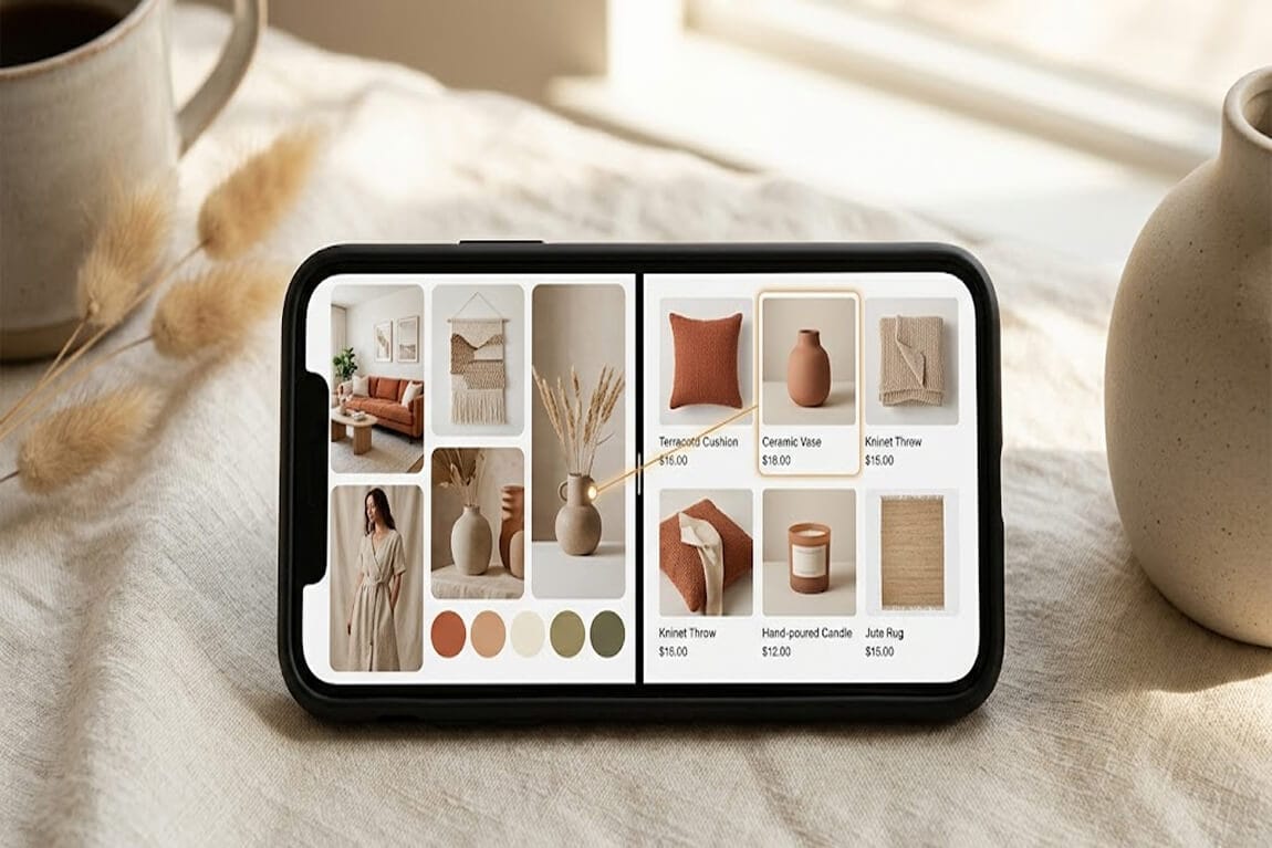
3. Princess Polly: Visual Autocomplete That Sells
Here's where it gets expensive for merchants who skip this...
Princess Polly doesn't just suggest search terms. They suggest products-with images, prices, and collection links-before you finish typing.
Type "blue dress" and you immediately see:
- Four product matches with full lifestyle images, names, and prices
- Trending searches to guide discovery (Sweaters, Red Dress, Sequin)
- Collection shortcuts (Vacation, Two Piece Sets, Mini Dresses)

This does three things at once:
- Reduces time to purchase - shoppers click directly into a product, skipping the results page entirely
- Builds confidence - you see what you're going to get before committing
- Handles ambiguity - typing "blue dress" shows you the type of blue dresses available, not just the words
And because Princess Polly runs on Shopify, this isn't some enterprise-only feature. It's achievable for any merchant with the right AI-powered search app.
If your autocomplete only shows text suggestions, you're leaving this conversion lever untouched.
4. Sephora: Faceted Search Starts in the Dropdown
Most stores treat search and filtering as separate experiences. Sephora merges them.

When you type "red lipstick," you don't just get products. You get:
- Category matches (Lipstick > Red)
- Brand matches (MAC, Fenty, NARS)
- Top product matches (with reviews and ratings visible)
This is faceted search before the results page. It lets shoppers self-select their path without extra clicks.
For stores with complex product attributes-think beauty, fashion, home goods-this pattern dramatically reduces search abandonment.
5. REI: The "No Results" Page That Still Sells
What happens when search fails?
Most stores show a sad, empty page: "No results found for 'waterproof hiking sneakers.'"
REI does something smarter.

Their "no results" page includes:
- Spelling suggestions ("Did you mean: waterproof hiking shoes?")
- Related categories to browse
- Popular products that might match intent
A dead-end search results page is a conversion killer. Every "no results" page should be treated as a merchandising opportunity, not an error message.
6. Urban Outfitters: Error Tolerance That Feels Invisible
Typos happen. Especially on mobile.
Urban Outfitters' search handles misspellings so gracefully that most shoppers don't even notice it's correcting them.

Type "jeens" and you get jeans. Type "sweter" and you get sweaters. No condescending "Did you mean...?" message-just the right products.
This is called error tolerance, and it's non-negotiable for mobile-first stores. If your search returns zero results for common typos, you're punishing customers for being human.
7. Gymshark: Search as a Discovery Tool
Gymshark's search doesn't just find products. It surfaces content.

Search "leg day" and you get leggings, shorts, and workout guides. This works because Gymshark understands that their shoppers aren't always looking for a specific SKU-they're looking for solutions.
If your brand has strong content (guides, lookbooks, tutorials), your search should surface it. Otherwise, you're hiding your best marketing assets behind a product-only filter.
8. Bombas: Mobile-First Search That Doesn't Frustrate
Over 60% of ecommerce traffic comes from mobile. Yet most search UIs are designed for desktop and then crammed onto smaller screens.
Bombas flips this.

Their mobile search features:
- Full-screen search overlay - no tiny dropdown competing with thumb-sized navigation
- Large, tappable product cards - images you can actually see
- Sticky filter bar - refine without scrolling back up
If your mobile search experience requires pinching, zooming, or precision tapping, you're bleeding conversions. Test your search on a phone. Actually try to buy something. You'll see the problems immediately.
The 4 Most Expensive Search UI Mistakes
Before you redesign anything, audit for these conversion killers:
- Hiding search behind an icon on desktop If you have more than 100 products, show the full search bar. Always. A magnifying glass icon adds one unnecessary click-and that click costs you.
- Text-only autocomplete Autocomplete without product images is a missed opportunity. Visual suggestions convert 30% better than text-only, according to Baymard Institute research.
- No fallback for failed searches Every "no results" page should offer a path forward-related categories, popular items, or a prompt to contact support. Never leave shoppers at a dead end.
- Ignoring mobile entirely Your mobile search deserves its own design. Desktop patterns don't translate. If you're not testing search on actual phones, you're guessing-and probably guessing wrong.
How to Actually Improve Your Search UI This Week
You don't need a full redesign. Start with these three moves:
Monday: Pull your search analytics. Look at your top 20 queries. Do they return relevant results? Are any returning zero results? Fix those first-this is low-hanging revenue.
Wednesday: Test your search on mobile. Try five common queries. Time how long it takes to reach a product page. If it's more than 10 seconds, you have a UX problem.
Friday: Add visual autocomplete. If your current search app doesn't support product thumbnails in suggestions, it's time to switch. This single change can lift search conversion rates by double digits.
This is exactly why we built Sparq, to give Shopify merchants search and filter experiences that actually work out of the box, without needing a dev team or a six-month redesign project.
The Bottom Line
Your search bar isn't a utility feature. It's a conversion engine-or it should be.
The merchants who treat search as an afterthought watch high-intent shoppers bounce. The ones who invest in search UI see those same shoppers convert at 2-3x the rate of browsers.
The examples above aren't aspirational. They're templates. Study them. Steal the patterns that fit your store. And stop accepting a search experience that was "good enough" three years ago.
Because your shoppers aren't comparing your search to what you had before.
They're comparing it to Amazon.