
As an eCommerce business owner looking to get the most out of your store, you constantly monitor metrics concerning it. You see that your campaigns and strategies are bringing in a lot of traffic but, sadly, you lack an expected rate of conversions and eCommerce sales. Many factors affect this and one of them, which is robably something you didn’t realize needs that much attention, is your Call to Action (CTA).
CTAs are one of the most important elements within your conversion funnel and one of the little elements of your eCommerce website that largely affects its effectiveness. Using CTAs is one of the best practices to enhance the conversion of your Shopify store and boost your ecommerce sales. If you want to master the use of CTAs, this article is the best for you. We present you with what you need to know about CTAs as well as some very excellent call to action examples you want to follow. Let’s get started.
What Are CTAs?

A call to action, as it relates to eCommerce, is an element on a webpage that directs a visitor to take necessary action or complete a task. It usually coming in the form of a hyperlinked text or button> CTAs is a tool that helps with your conversion by ensuring, through clear words, that your visitors or audience know just where to interact with for action to be taken on content provided to them.
There are different call to action examples depending on the platform they are used on as well as the content they look to guide action on. They are used in every step of the buyer’s journey and some of the more common CTAs include words like “subscribe”, “buy now”, “purchase”, “sign up”, and “learn more”, among others.
Characteristics Of Good CTAs

Before we dive into the call to action examples, we want to show you what defines a good CTA. Some general characteristics regardless of the platform on which you make use of them include:
They Are Easy To Find
With CTAs, one of the most important things you want is to make sure they are easy to find within your webpage content. You want them to be easily and highly distinguishable from the rest of your webpage content so your visitors always find them. One of the best ways to do this is to make the color of texts or buttons negative to the color of other content.
CTAs Contain Clear Action Phrases
Action phrases are the words you use to direct visitors to take action. You want these phrases to be very clear and precise about the action you want users to perform. Of course, your use of words, as said earlier, depends on the content associated with it.
They Create A Sense Of Urgency
A lot of your visitors do not intend to subscribe to a newsletter after leaving your website. Your best bet is having them perform that action at that very moment. So good call to action examples are accompanied by a sense of urgency, either owing to the content they are associated with or the action phrase itself. Including “now” within action phrases is what a lot of eCommerce businesses resort to in order to boost their ecommerce sales.
They Actually Work
A good CTA performs the exact action it is designed for. You want your CTA to work and direct you to the right page or part of your eCommerce website. It is only through this that your website users proceed through your conversion funnel and your eCommerce sales increase.
Shopify Website Examples To Model
Department Of Motivation
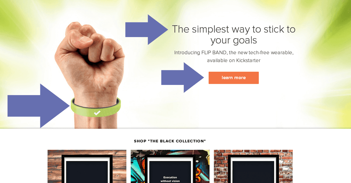
On this webpage, you see a message pointing to the introduction of a wristband that helps you “stick to your goals”. How does a regular, “tech-free” wristband do that? This is what the call to action leads to. To feed your curiosity, its action phrase tells you to learn more about this unpopular product.
The call to action is placed in a box that is very distinguishable from the rest of the content. While every other image and text is placed against a green and white backdrop, the text “learn more” is written in a more visible white color placed on an orange button. With additional arrows pointing directly to the most important areas of the page, including the call to action, you definitely won’t miss it.
FreshBooks
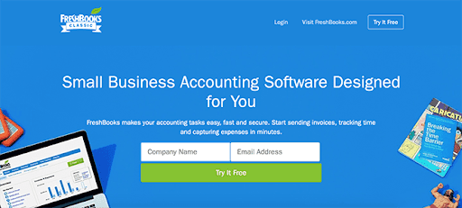
Here is another example that properly makes use of a negative-colored button to distinguish the call to action from the rest of the content on the page. Looking at the image, you see that all content is placed on a blue background with other text written in white. The call to action “Try It Free” is placed in a green box and its accompanying white input boxes are the most distinguishable from others.
Now, let’s make a comparison; you probably haven’t noticed that there is another call to action on this same image that performs the same function. Look to the top right and you will see another CTA with the text “Try It Free”.
Why didn’t you quickly notice it? That’s because it does not have any distinguishable features from other content and its placement does not do it any good. You aren’t even assured it performs the function we have assumed it does and, as a business, you stand the chance of losing a lot of eCommerce sales with that type of CTA.
You want your CTA to look like the one at the bottom-placed in a distinguishable green box.
Pro Presets
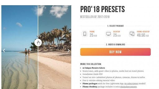
Now, this is one CTA example that creates urgency using its action phrase. Like others, it is very distinguishable from other content as it is placed on a large bright orange button and written in unique white text. The “BUY NOW” action phrase urges visitors to purchase the “best seller of 2017/2018” at that moment.
4Ocean
The call to action example here is short but understandable due to its accompanying content. The business seeks monthly donations for its mission to get the sea rid of harmful material. As this is a donation it wants you to make monthly, the call to action uses the text “Subscribe” as its action phrase.
This CTA is placed within a distinguishable white button and written in a unique blue text to separate it from other content. Your visitors can’t miss it.
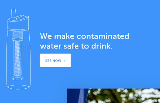
Lifestraw
Lifestraw tells you it helps to “make contaminated water safe to drink” using a bottle; a rather bold and direct statement that solves a continuous challenge in our modern world. The CTA then tells you to see how the brand takes care of something a lot of others haven’t had success in. To separate it from other content while keeping the brand colors, it is a blue text written in a large white box, rather than white texts and elements against a blue background.
Take Outs
From all these, you see that the action phrases are appropriately determined by the accompanying content they seek to guide visitors on. CTAs are a different color to other elements of the web page or popup, are placed at a point where necessary action is expected to be made, and are made as large as possible so that they are never missed.
In creating your own CTAs, you want them to show these characteristics, this way they can help to improve your ecommerce sales.


