
Accessibility-First Search and Filters: The Inclusive Design Rules That Expand Your Audience and Convert 20% More
15% of global shoppers have a disability. People with disabilities in the US alone hold $490 billion in purchasing power. And most Shopify filter sidebars are completely inaccessible to them. Here's how to fix it, and why fixing it helps everyone else too.
The support ticket came in at 2:17pm on a Thursday.
"I've been trying to use your website filters for ten minutes with my keyboard and screen reader. I can't navigate through the size options. I can't apply a filter without a mouse. I gave up and bought from someone else."
The merchant who showed me this was genuinely upset. Not in a legal-exposure way. In an "I had a customer who wanted to spend money with me and my website stopped them" way.
She'd spent real time on her store. Good product photography. Clear descriptions. A filter sidebar with color, size, material, and occasion. A search bar that worked well.
The problem: her filter sidebar required a mouse. Every filter option was a CSS-styled custom element with no keyboard navigation, no ARIA labels, and no screen reader support. To the assistive technology her customer was using, the filter sidebar was essentially invisible.
That customer tried to give her money. The filter system said no.
Here's the part that should stop you cold.
15% of the global population has some form of disability. People with disabilities in the US hold $490 billion in annual purchasing power. ADA-related website lawsuits exceeded 4,600 in 2024. The European Accessibility Act requires ecommerce compliance. And the most common WCAG failure on ecommerce sites is in product filters and form elements.
This is not a niche concern. It's a meaningful segment of your potential customers being turned away by inaccessible discovery tools.
And here's the part that makes this genuinely interesting from a conversion standpoint: every accessibility fix that makes your search and filters work for disabled users also makes them work better for everyone else. This is not a trade-off. It's a compounding improvement.
Why Accessibility and Conversion Are the Same Problem
Here's the weird part that accessibility conversations usually miss.
The web accessibility standards (WCAG 2.2) that accommodate keyboard-only users, screen reader users, and low-vision users describe design patterns that are clearer, faster, and less cognitively demanding for everyone.
Keyboard navigation that works properly means tab order is logical. That means the page structure is logical. A logical page structure benefits every user, not just keyboard users.
Color contrast that meets the 4.5:1 ratio for low-vision users makes your filter labels easier to read for everyone in bright sunlight, on a low-quality screen, or when fatigued.
Clear, visible focus indicators that help keyboard users know where they are on the page also help mobile users who are rapidly tapping between filter options and need to know which one is selected.
Accessible design is universal design. When you build for the most constrained user experience, you almost always improve the experience for the least constrained one too.
The conversion data consistently shows this. Stores that implement comprehensive accessibility see 10 to 20% improvements in overall conversion rate, not just in disabled user segments. Because the accessibility fixes address fundamental usability problems that affect every visitor to some degree.
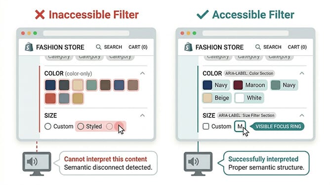
The Six Accessibility Rules for Shopify Search and Filters
These aren't the complete WCAG 2.2 specification. These are the six highest-impact rules specifically for your search bar and filter sidebar, the two elements that most directly affect product discovery and conversion.
Rule 1: Keyboard-Navigable Filter Controls
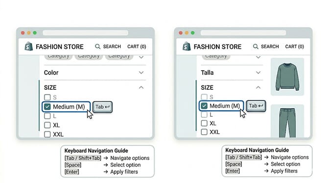
This is the most common and most costly accessibility failure in Shopify filter systems.
Most custom filter sidebars are built with CSS-styled div elements and JavaScript click handlers. They look great on screen. A mouse user has no trouble with them. But a keyboard user pressing Tab to navigate through the page either skips the entire filter sidebar (if it's not in the keyboard focus order) or gets trapped inside it (if the Tab key doesn't move focus predictably through filter options).
What keyboard accessibility for filters requires:
Every filter option must be reachable with the Tab key. The Tab order must be logical and predictable: from the search bar to the first filter category, through each option within that category, then to the next category.
Selecting a filter option must work with the Space bar (for checkboxes) or Enter key (for buttons and links). Pressing Escape must close any expanded filter dropdowns or overlays.
A visible focus indicator, typically a colored border or outline, must appear on the currently focused element. The browser's default focus ring is often suppressed by CSS resets, which is why so many filter sidebars appear to have no keyboard navigation even when the underlying HTML is technically focusable.
The fix: restore visible focus styles, ensure all filter elements are native HTML form elements or have appropriate ARIA roles, and test the complete filter flow using only a keyboard before any release.
Rule 2: Color Labels That Don't Rely on Color Alone
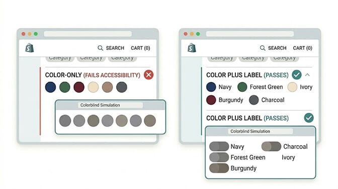
Color swatches with no text labels are one of the most common accessibility failures specifically in fashion and home goods ecommerce.
8% of men and 0.5% of women have some form of color vision deficiency. For someone with deuteranopia (red-green color blindness), your "Forest Green" and "Burgundy" swatches may look identical. If the only differentiation between your color filter options is the color of the swatch itself, those customers can't reliably use your color filter.
The WCAG requirement: color must not be the only visual means of conveying information. Every color filter option must have a text label in addition to the color swatch.
This is a relatively simple fix and one that produces an unexpected secondary benefit: text labels on color swatches also help customers who know what color they want but can't reliably identify whether "that swatch" is what they'd call navy or cobalt. The label removes the ambiguity for everyone.
Additional requirement: the selected/active state of a filter option must not be conveyed through color change alone. A blue border that turns green when selected may be invisible to colorblind users. Use multiple indicators for selected state: a checkmark, a text change (from "Navy" to "Navy (selected)"), or a border in addition to color change.
Rule 3: Screen Reader-Compatible Filter Labels and Structure
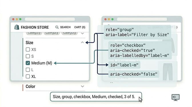
A screen reader is software that reads webpage content aloud for blind or low-vision users. Most screen readers navigate by HTML structure and ARIA labels rather than visual layout.
The most common screen reader failure in filter sidebars: filter options are labeled only through their visual context, not through their HTML structure. A screen reader reading your filter sidebar may announce "Medium" without any indication of which filter category "Medium" belongs to. Is that a size? A color? A quality level? Without the structural context that visual users get from the sidebar layout, the filter becomes confusing.
What screen reader compatibility requires:
Filter categories should be marked as groups with an accessible name. The HTML fieldset and legend elements achieve this natively. ARIA role="group" with aria-label provides an equivalent solution.
Each filter option should have an accessible label that includes the option name. For color swatches, the image alt text or aria-label should be the color name, not "color swatch."
The current filter state should be announced. When a filter is applied, the page should announce the change, either through an aria-live region or through focus management that brings the user to the updated results.
Filter counts should be part of the accessible label. "Cotton (12 products)" should be readable to screen readers as a single unit, not as "Cotton" and "12" as separate unlabeled text fragments.
Rule 4: Search Bar Accessibility and Error Handling
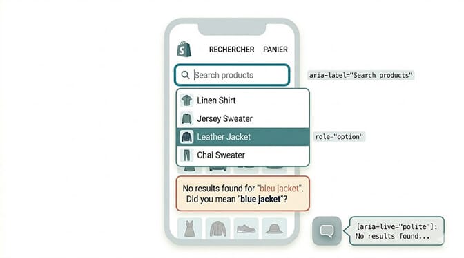
Your search bar has its own set of accessibility requirements that most search implementations fail to fully meet.
Autocomplete and suggestions must be keyboard navigable. When your search bar shows autocomplete suggestions as a customer types, pressing the down arrow key must move focus into the suggestion list, arrow keys must navigate between suggestions, Enter must select a suggestion, and Escape must close the suggestion list without leaving the search bar.
Search results updates must be announced. When the page updates after a search query, screen readers need to know the page has changed. An aria-live region that announces "Showing 14 results for 'cotton jacket'" tells screen readers to re-read the updated content.
Zero-result states must be clear and helpful. A zero-result page that only shows an empty space with a faint gray message fails accessibility and usability simultaneously. The zero-result message must have sufficient color contrast, must be announced by screen readers, and should provide a clear next action (related searches, category browsing, contact support).
Typo suggestions must be text-based. "Did you mean" suggestions that rely only on visual styling to indicate they're suggestions are missed by some assistive technologies. The suggestion should be a clear, labeled link with text that includes the suggested correction.
Rule 5: Touch Target Sizes for Mobile Filters
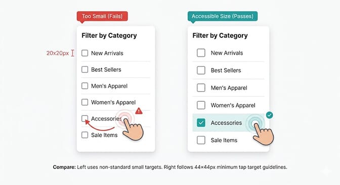
This one affects everybody but is specifically a WCAG requirement for users with motor disabilities, including hand tremors, limited precision movement, and single-switch access.
WCAG 2.2 requires interactive elements to have a minimum touch target size of 24x24 CSS pixels, with WCAG 2.2 Level AA recommending 44x44px for reliable touch interaction. The specific WCAG 2.5.5 Success Criterion recommends 44x44px as the target.
Most filter checkboxes on Shopify stores are too small. A 16x16px checkbox that's perfectly fine for mouse users is difficult to reliably tap on a touchscreen, especially for users with reduced motor precision.
The fix requires two things: ensuring the visible element itself is large enough, and ensuring the clickable/tappable area is at least 44x44px even if the visible element is smaller (through padding or CSS manipulation of the hit area).
This fix benefits every mobile user, not just those with motor disabilities. Removing the micro-frustration of slightly missing a filter checkbox when you're shopping on your phone produces measurable improvement in mobile filter engagement across all users.
Mobile search and filter accessibility is particularly worth prioritizing because mobile accounts for the majority of ecommerce traffic while also having the highest cart abandonment rates. Many of those abandonments trace to filter and navigation friction that accessibility-compliant touch targets would directly address.
If you want to see how your current search and filter experience performs on mobile specifically, check your search analytics in Sparq for mobile-specific query and filter engagement data. The gap between desktop and mobile search conversion often correlates directly with filter usability on touchscreens.
Rule 6: Focus Management After Filter Application
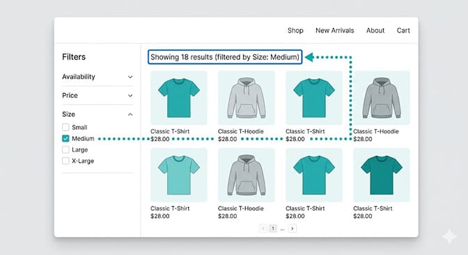
This is the accessibility rule that almost no Shopify filter system implements correctly, and it's the one that causes the most confusion for keyboard and screen reader users.
Here's what typically happens when a keyboard or screen reader user applies a filter: they tab to a filter option, press Space to select it, and the product grid updates. But their keyboard focus stays on the filter option they just clicked. The screen reader announces nothing about the page change. The user has no indication that anything happened to the product grid.
What should happen: when a filter is applied, keyboard focus should move to the results area or to a "results count" element that announces the new state. "Showing 18 results for Size: Medium" being announced at the moment the filter applies tells the user the action worked and gives them context about what changed.
This requires intentional focus management: JavaScript that moves keyboard focus to the results region after a filter change, and an aria-live region that announces the filter application and result count.
This improvement directly reduces the cognitive load of filtering for all users. Even mouse users benefit from a clear, immediate announcement of what the filter produced. The accessibility requirement and the conversion-focused UX improvement are identical.
The Business Case in Plain Numbers
Let's be concrete about what accessibility improvements are worth.
15% of the global population has a disability. If your store gets 10,000 monthly visitors, that's approximately 1,500 visitors who may rely on some form of assistive technology or accommodation. If your current filter sidebar is inaccessible to that segment, you're not converting any of them from filter interactions.
People with disabilities in the US hold $490 billion in annual purchasing power. That's not a rounding error in your market.
ADA website lawsuits exceeded 4,600 in 2024 and are increasing. The cost of legal defense and settlement significantly exceeds the cost of implementing accessibility upfront.
The EU Accessibility Act requires ecommerce compliance. Stores selling into European markets that don't meet WCAG 2.2 AA standards face regulatory action.
And the conversion improvement data is consistent: stores that implement comprehensive accessibility see 10 to 20% improvements in overall conversion rate, not just within disabled user segments, because the same fixes that serve disabled users improve usability for everyone.
This is not a "nice to have if you have time" conversation in 2026. It's a meaningful revenue optimization with a legal compliance dimension and a customer respect dimension rolled into one.
The Takeaway
The customer who sent that support ticket didn't come back.
The merchant fixed her filter sidebar over two weeks. New keyboard navigation. Proper ARIA labels. Screen reader-compatible structure. Color labels added to all color swatches. Touch targets upgraded for mobile.
She didn't hear from that specific customer again. But her mobile conversion rate improved 14% in the two months after the changes. Her filter engagement rate increased across all devices. And she received two unsolicited notes from customers saying her store was "easy to use" in a way they found notable.
The accessibility work was done for the right reason: a customer had been excluded. But the results landed across every visitor, not just those with disabilities.
That's the case for accessibility-first search and filters. It's the right thing to do. It's also a conversion improvement. These two things are the same improvement.
Ready to build search and filter experiences that work for every customer? Start with Sparq on your Shopify store and build discovery tools that nobody gets turned away by.
Frequently Asked Questions
What is accessibility-first design for Shopify search and filters?
Accessibility-first design for Shopify search and filters means building product discovery tools that work for all users regardless of how they interact with the web, including keyboard-only users, screen reader users, low-vision users, and users with motor disabilities. It follows WCAG 2.2 guidelines and requires specific implementations: keyboard-navigable filter controls, color labels that don't rely on color alone, ARIA labels for screen readers, minimum 44x44px touch targets on mobile, focus management after filter application, and screen reader-compatible search result announcements. Accessibility-first design consistently improves conversion for all users, not just those with disabilities, because the same patterns that serve disabled users reduce friction and cognitive load for everyone.
Does fixing search and filter accessibility actually improve conversion rates?
Yes, measurably. Stores that implement comprehensive accessibility improvements see 10 to 20% improvements in overall conversion rate because the same patterns that accommodate disabled users reduce friction for everyone. Keyboard-accessible filters mean logical tab order, which means a clearer page structure. Visible focus indicators help mobile users distinguish selected filter states. Proper touch target sizes improve mobile filter engagement for all touchscreen users. Color labels benefit users in bright sunlight or on low-contrast screens. The accessibility improvements are UX improvements that happen to also meet legal requirements.
What are the most common accessibility failures in Shopify filter sidebars?
The five most common failures are: filter controls that can't be navigated by keyboard alone; color swatches with no text labels that rely on color as the only differentiator; filter options with no ARIA labels or group structure making them confusing for screen readers; touch targets smaller than the 44x44px WCAG recommendation making mobile filtering difficult for motor-impaired users; and no focus management after filter application leaving keyboard and screen reader users unsure whether the filter took effect. Any one of these creates a complete barrier for users relying on those accessibility accommodations, and each one also degrades the experience for non-disabled users.
Is Shopify automatically accessible for disabled users?
No. Shopify provides a platform, but individual store accessibility depends entirely on your theme, apps, and custom code. Many popular Shopify themes have accessibility failures in filter and search implementations. Third-party filter and search apps vary significantly in their accessibility compliance. A store running Shopify is not automatically WCAG compliant. You need to audit your specific theme and apps, test with keyboard navigation and screen readers, and remediate the issues found. The most common failures are in the exact elements that most affect conversion: filters, search bars, form fields, and variant selectors.
What is the legal risk of having an inaccessible Shopify filter and search experience?
Significant and increasing. ADA-related website lawsuits in the US exceeded 4,600 in 2024, a 300% increase since 2018. Courts have consistently ruled that ADA requirements apply to ecommerce websites. The European Accessibility Act required compliance from June 2025. Non-compliant stores face lawsuit risk, settlement costs, and potential regulatory action in EU markets. The cost of proactive remediation is substantially lower than legal defense or settlement. Beyond legal risk, inaccessible stores are turning away the 15% of the global population with disabilities, who hold $490 billion in annual purchasing power in the US alone.