As an eCommerce business, you have tracked activities on your Shopify website and noticed that a majority of your store visitors leave without making a purchase. There is always room to improve call-to-action, design, products, etc. But a key neglected issue remains on how your Shopify store UX could probably be the factor causing this to happen.
Now, you want to know what to do with your Shopify design to fix any issues you have with it. You want to know how to properly optimize your UX design to keep visitors longer on your website and ensure a higher conversion rate. Not to worry, we have you covered on this with the best tips and practices to follow. Let’s get right to it.
Best Practices For Your Shopify Store UX Design

Keep Your Shopify design Simplistic
Maintaining simplicity with your Shopify design takes care of a whole lot of problems and comes with a barrage of advantages to your Shopify website. You make navigation easier for your website visitors through less cluttered interfaces and ensure your website loads up faster thanks to fewer website elements.
Simplicity also ensures your website is easy to skim through. With 79% of new visitors to an eCommerce website opting to scan through content rather than being overly invested, a simple website design helps you a lot. How do you make your website design simple?
- Eliminate Unnecessary Elements: You must ask yourself what elements are necessary for your website design and which can be done away with so you have a website that converts. You want to know the design elements just serving ornamental purposes on your Shopify website. The most common website elements you may eliminate include website images in your header or footer, as well as image borders, and extra images on individual web pages. Poorly optimized parallax scrolling, automatic sliders, ghost buttons, and background videos are also points to consider.
- Limit the use of colors: In your design, you also want to limit the number of colors you make use of. Two or three colors that look good with each other are enough. You don’t want to oversaturate your website. This could be irritating to your website visitors’ eyes.
Optimize Your Use of CTAs

CTAs are particularly important elements of your Shopify website as they direct your visitors to take the next step in your conversion funnel. Properly optimizing how they are placed on your website means your visitors know just what to engage with to proceed. So what are the best practices concerning CTAs?
- Limit how many you use on a single page: Making use of a lot of CTAs on a single page proves to be overwhelming for your website visitors. They don’t know which one to go with and end up not acting on them at all. What you want to do is ensure you don’t use more than three on a page, especially a homepage. For your product landing pages, using one CTA passes a clear message and makes it easier for your visitors to take necessary action.
- Position Them Properly: You place CTAs at positions within your content where you expect your website users to take action. You want to place one just at the relevant end of content, as they know that is what they have to engage with to take part in what you are pitching to them.
- Make CTAs Distinguishable: Doing this involves practices to separate your CTAs from other content on your Shopify website. You want to make this a little larger than other content, in a different color from other website elements, or within buttons. You also want to keep enough space around them, ensuring there is no clutter and your website visitors inevitably see it very clearly.
Let Product Copy And Content Lead The Way

A lot of Shopify website owners have wondered, one time or another, what to consider first; the website design or the content within it. Our full-hearted advice? Consider your content first.
Your Shopify website visitors are convinced to purchase if the content displayed to them fits what they are looking for and not because your website design looks good. You want to identify what customers need or prefer, then make your copy and select images, among others, based on these. What you don't do is select a theme or create a design and start trying to fit in content, which becomes frustrating and, sometimes, non-actionable.
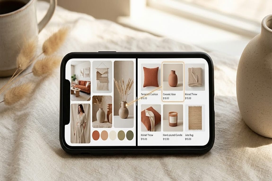
Design With Product Discoverability In Mind

Separated from simplicity in design, an intuitive website design is one that is easy to learn and navigate through. For easy product and service discoverability, this is important. To improve your Shopify store UX, what you want to do is:
- Make use of familiar words and structures: You don’t want your website visitors guessing what a word means, so you make use of words that you expect them to be familiar with. Of course, this depends on your target audience. “Familiar structure” relates to common placements for elements within eCommerce websites. For example, the cart is very commonly placed at the top right corner of every eCommerce page. Opting to place it somewhere else could prove detrimental to your website’s navigation. To get the most out of your Shopify design, maintain a structure with elements placed at their traditional positions.
- Create categories and subcategories: Grouping your products helps website visitors easily find them. While creating your categories and subcategories, we want you to know that a product may be placed within two categories. For instance, a television may be placed within the “electronics” and “living room” categories. Product tags also help with grouping products, especially about your search function.
Optimize Your Search Function

One of the most important elements affecting your Shopify store UX is the search function. Some visitors even refer to it immediately after they arrive on your website. You want your search function to be as effective as possible and making use of the default Shopify search bar, at large, does not help with this. There is a whole lot more functionality you get from advanced search apps like Sparq as well as personalizing your Shopify search experience
For your Shopify store UX, some important points to take note of about the search function include:
- Keep it positioned at the right-hand side of the center of the page. This is another website element with a “familiar structure”.
- Avoid making use of a search icon but make use of an open text box so your visitors have easy and immediate access to it
- Incorporate autocomplete and autocorrect functionalities. Of course, these are available to you with Sparq.
- Keep a record of user searches for future Shopify website and store optimizations. Again, only an advanced search app like Sparq allows you to do this.
Optimize Your Shopify Store UX Today
Your Shopify store UX plays a major role in your conversion funnel. With a lot of competition in the eCommerce space, you want to have all the tools required to make appropriate changes and keep customers coming back. Sparq is one of those tools helping with the all-important search functionality, on the user experience of your Shopify website. Don’t continue waiting, get started today!